
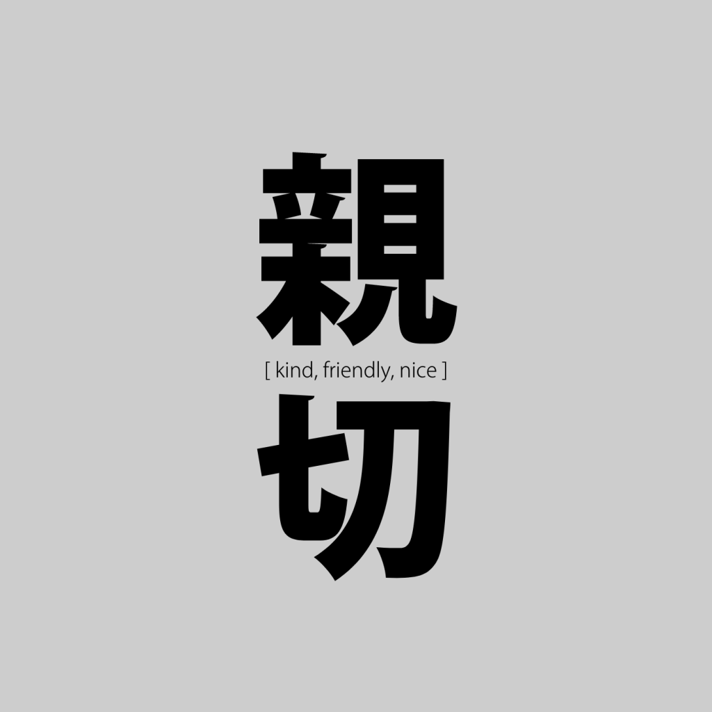
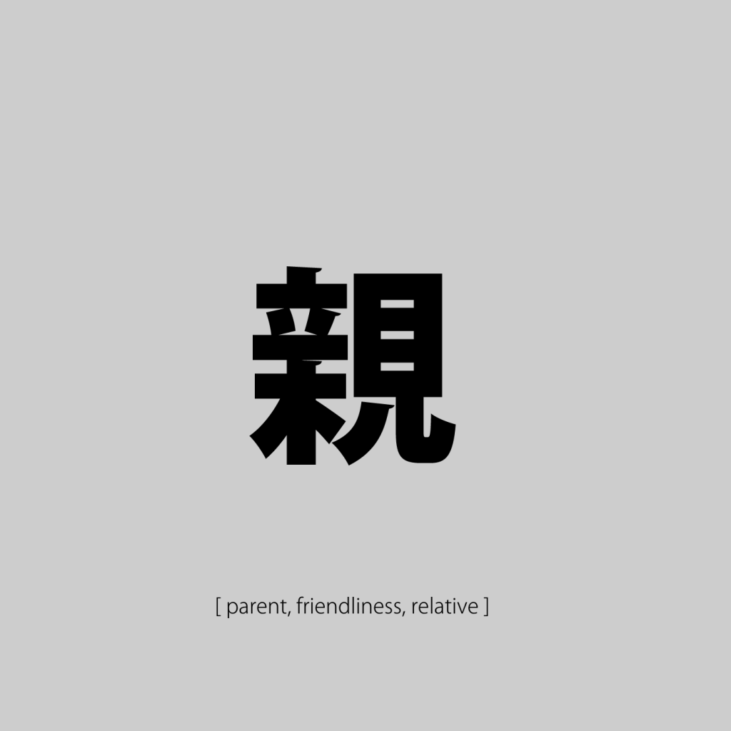
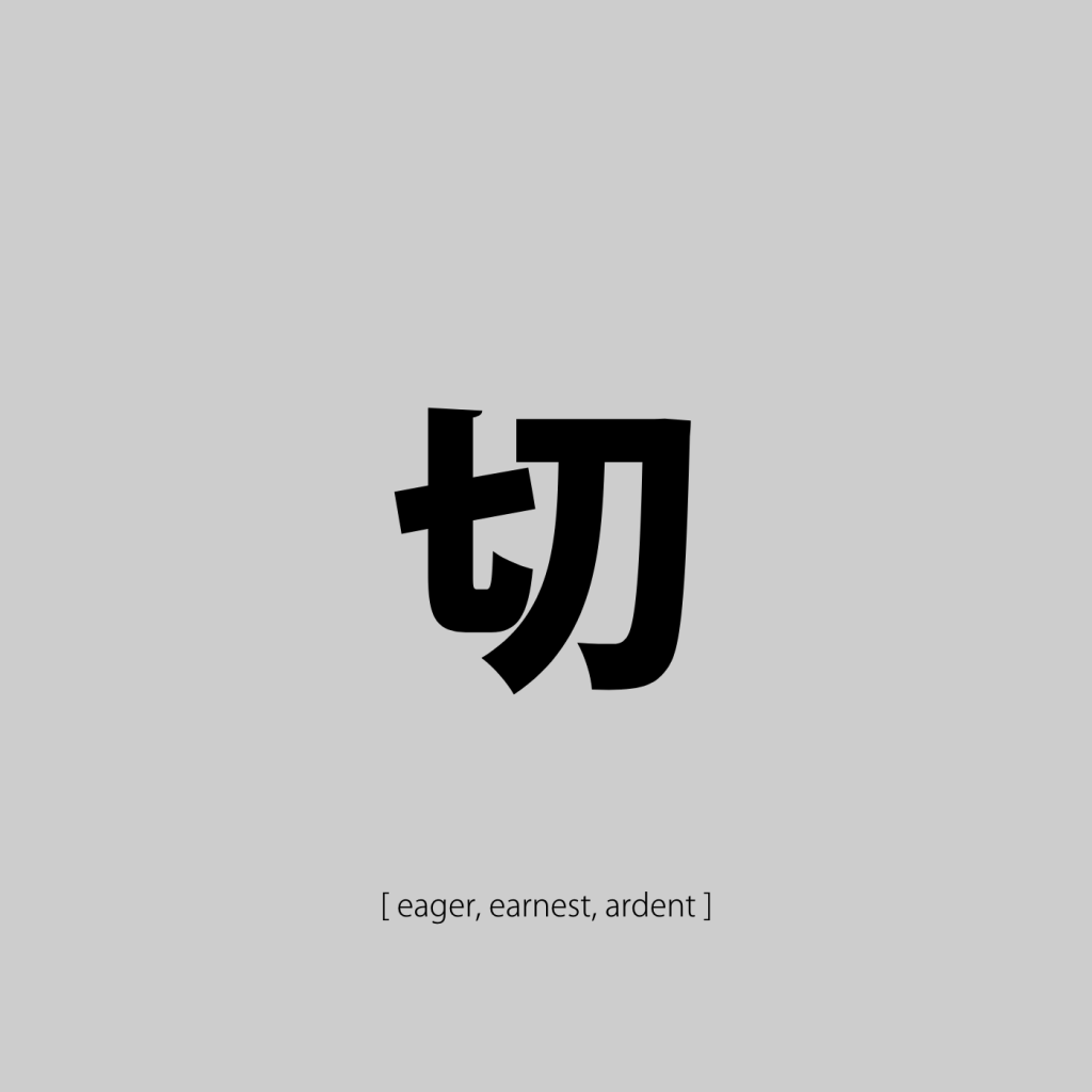
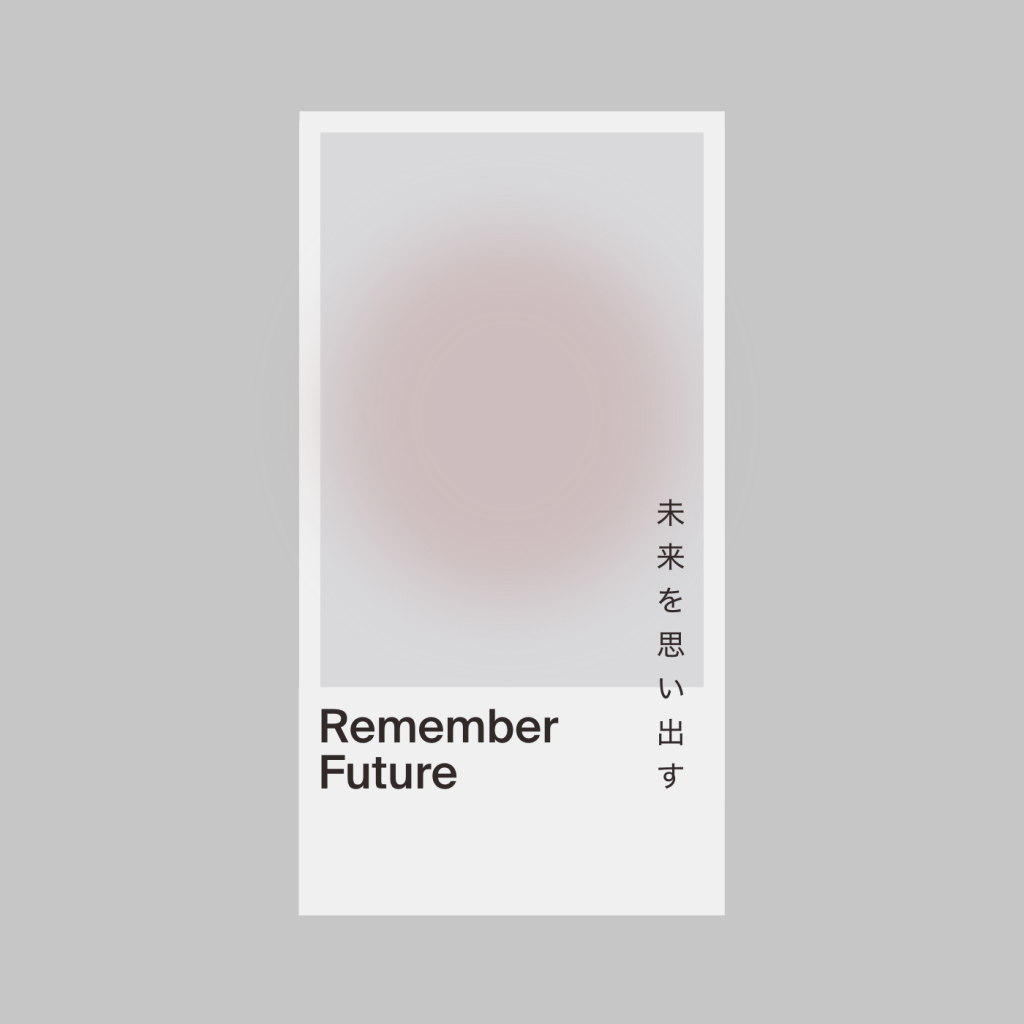
This example is about the word Kindness (親切), which consists of the two characters 親 and 切. Individually, the characters mean “parent”, “friendliness”, “relative”, as well as “eager”, “earnest”, “ardent”. In the corresponding combination, the word Kindness (しんせつ or Shinsetsu) is created.
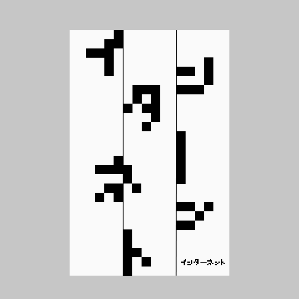
Japanese Katakana Experiments. The form of the Japanese syllabic writing used especially for scientific terms, official documents and words adopted from other languages
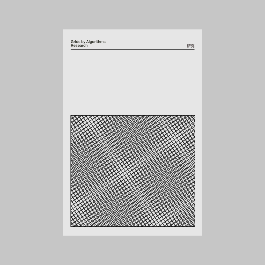
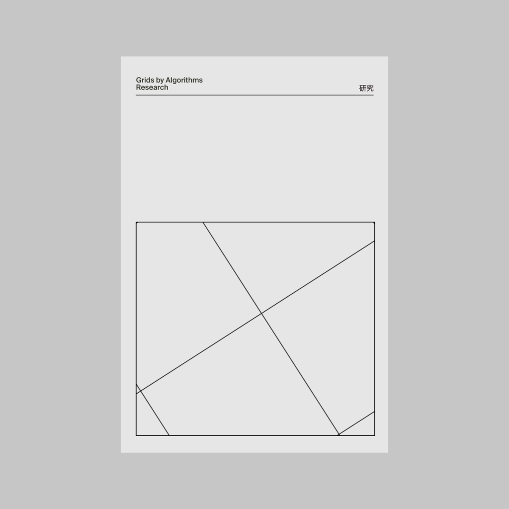
A small after-hour script which I programmed based on P5JS to manipulate the versatility of grids. The script adds more randomness and number of lines every 1500 milliseconds. Pretty ? however!
As some of you know I’m learning Japanese for quite some time now and while I started to experiment with a new method to learn Kanji by J.W. Heisig I felt the need to just have some fun and experiment with the type, characters and minimalism.
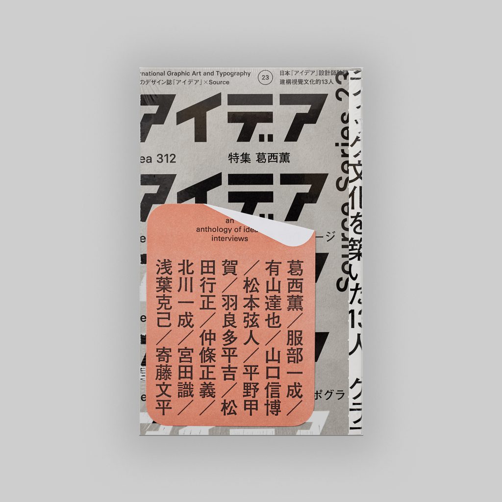
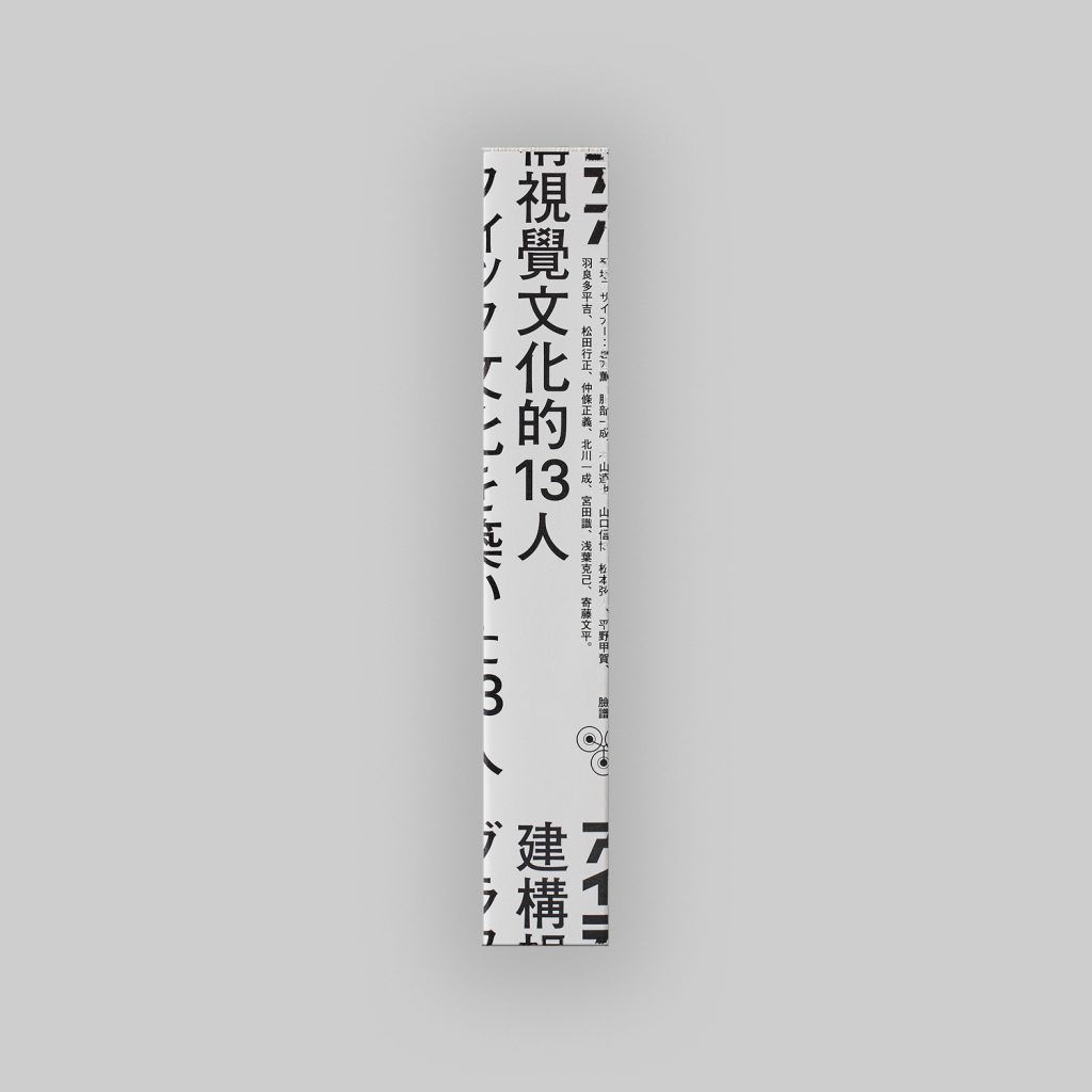
As a great admirer of Japanese aesthetics, I recently received a new book by Taiwanese designer Wang Zhi-Hong called “The Thirteen People Who Built the Graphic Culture of Contemporary Japan” or 建構視覺文化的13人. To be honest, I’m blown away by how beautiful the packaging and cover of the book is!