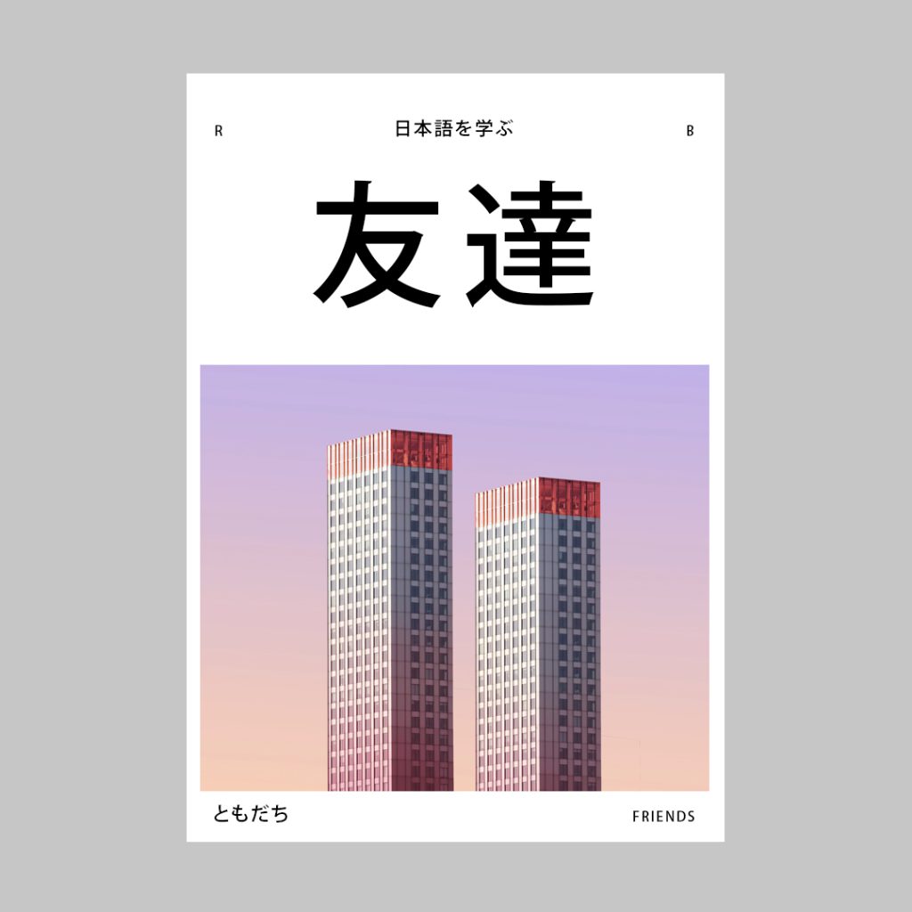
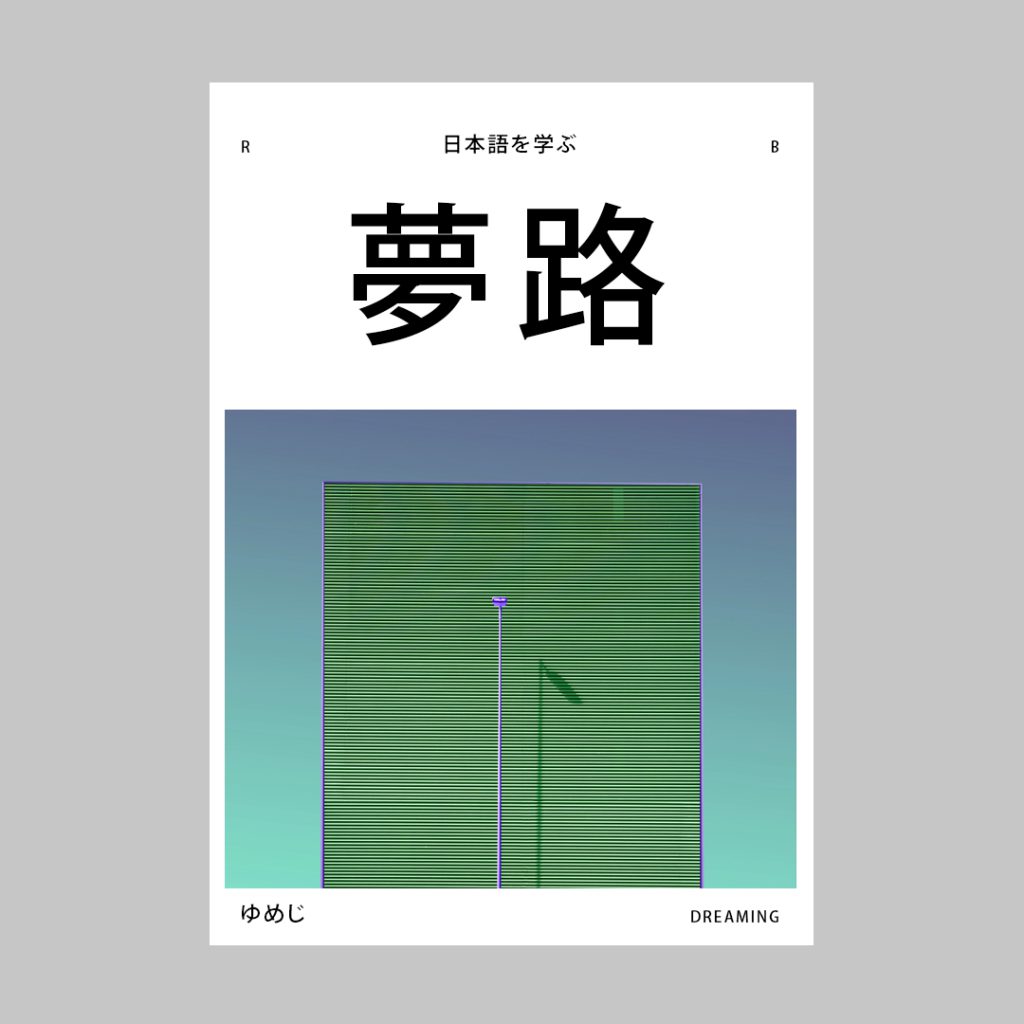
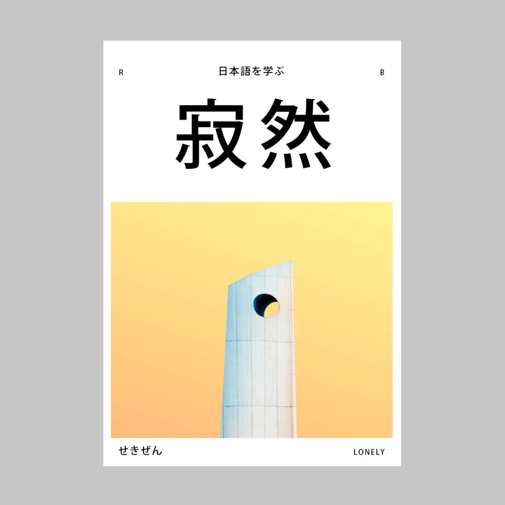
Dreaming Friends is a small personal series of posters in which I visually explore the theme of 漢字 (Japanese kanji).
The Portuguese type foundry Milieu Grotesque has featured my branding, which was realized with their font “Maison Neue”, on their website. Obrigada!
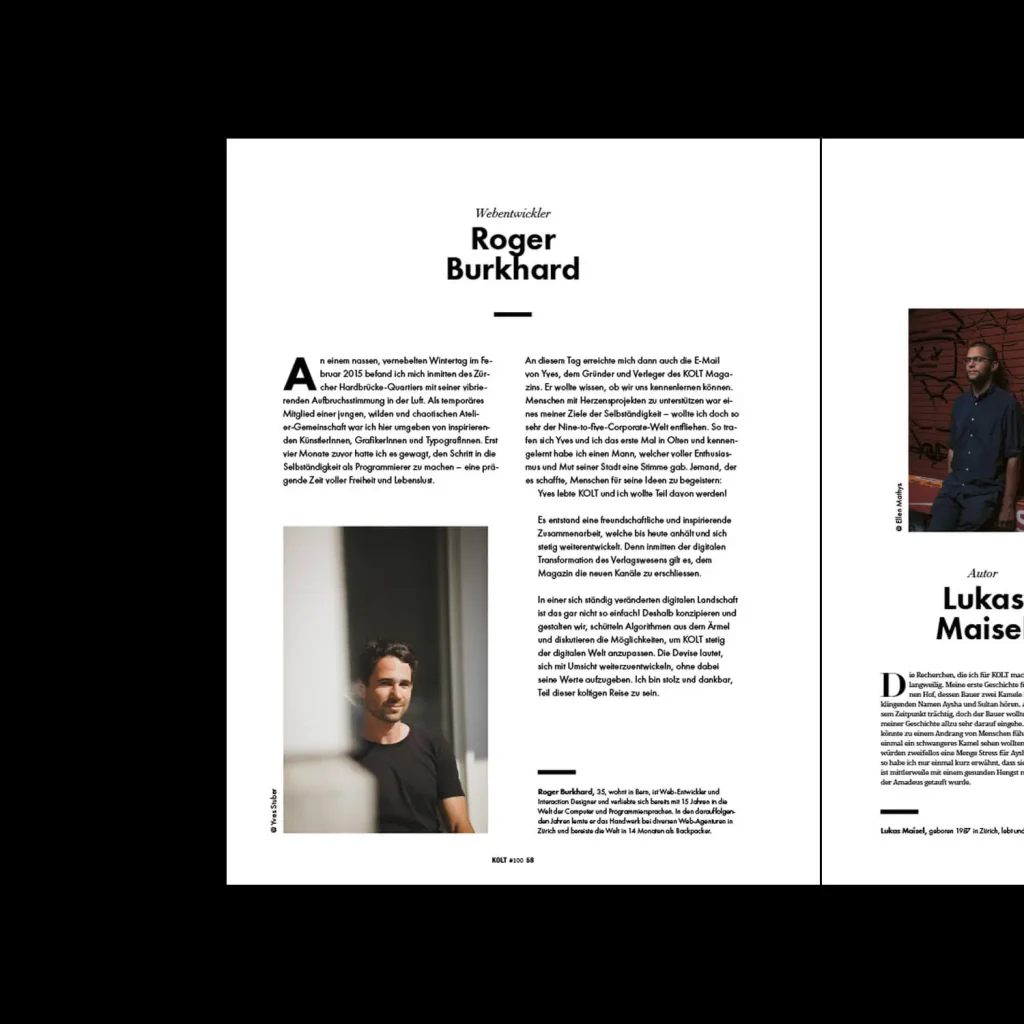
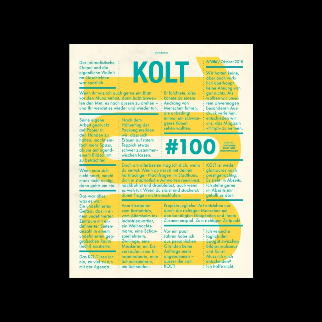
KOLT magazine is celebrating its 100th issue, giving a voice to the people who have inspired, birthed, promoted, shaped and filled the magazine over the past nine years. Happy to be part of this journey! To the next 100 issues!
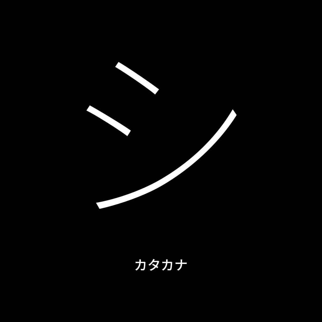
I’ve been learning Japanese for a few months now. And the hiragana and katakana syllabaries in particular invite me to explore typography シ
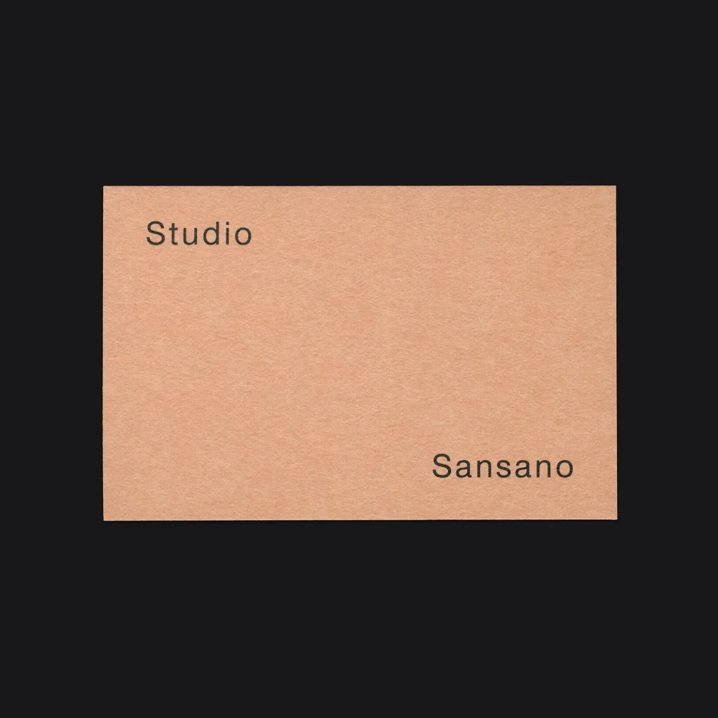
The branding project for Studio Sansano – designed by Atelier Pol and coded by me, was featured in the Japanese design blog North East. Domo Arrigato!
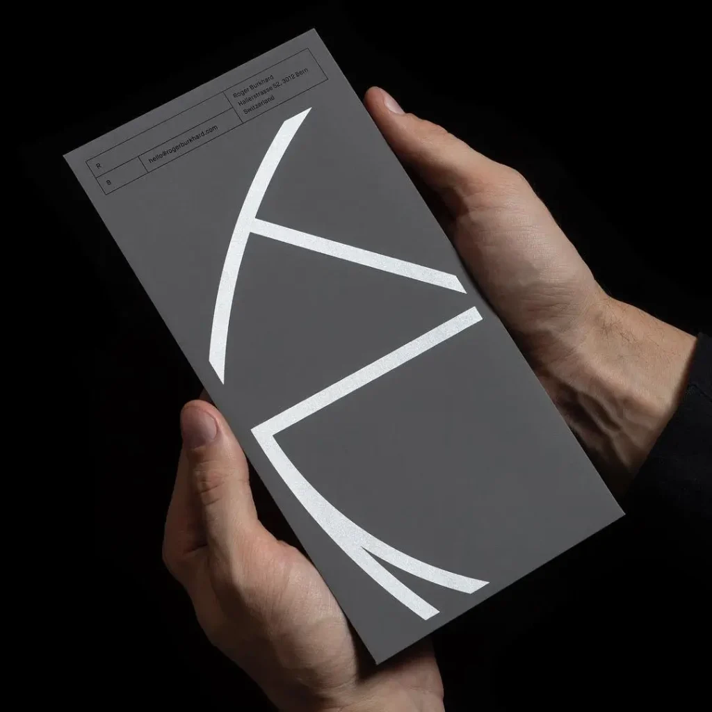
Happy to show you my new long pocket envelopes – designed by Lundgren+Lindqvist. The envelope shows an abstract shape of my logo and is screen printed in black and silver.
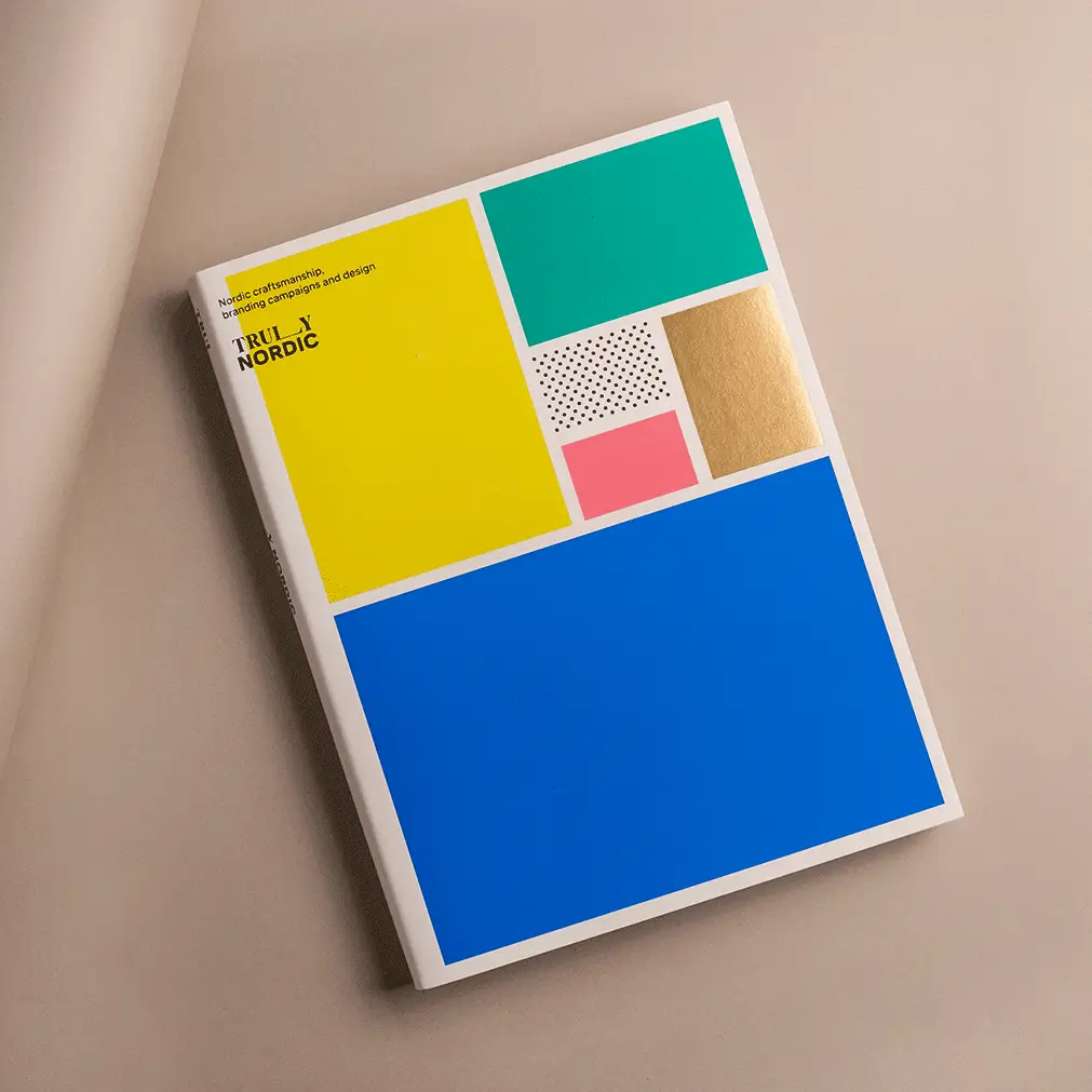
Happy to announce that my branding, designed by Swedish design studio Lundgren+Lindqvist, has been published in the latest book Truly Nordic by Victionary.
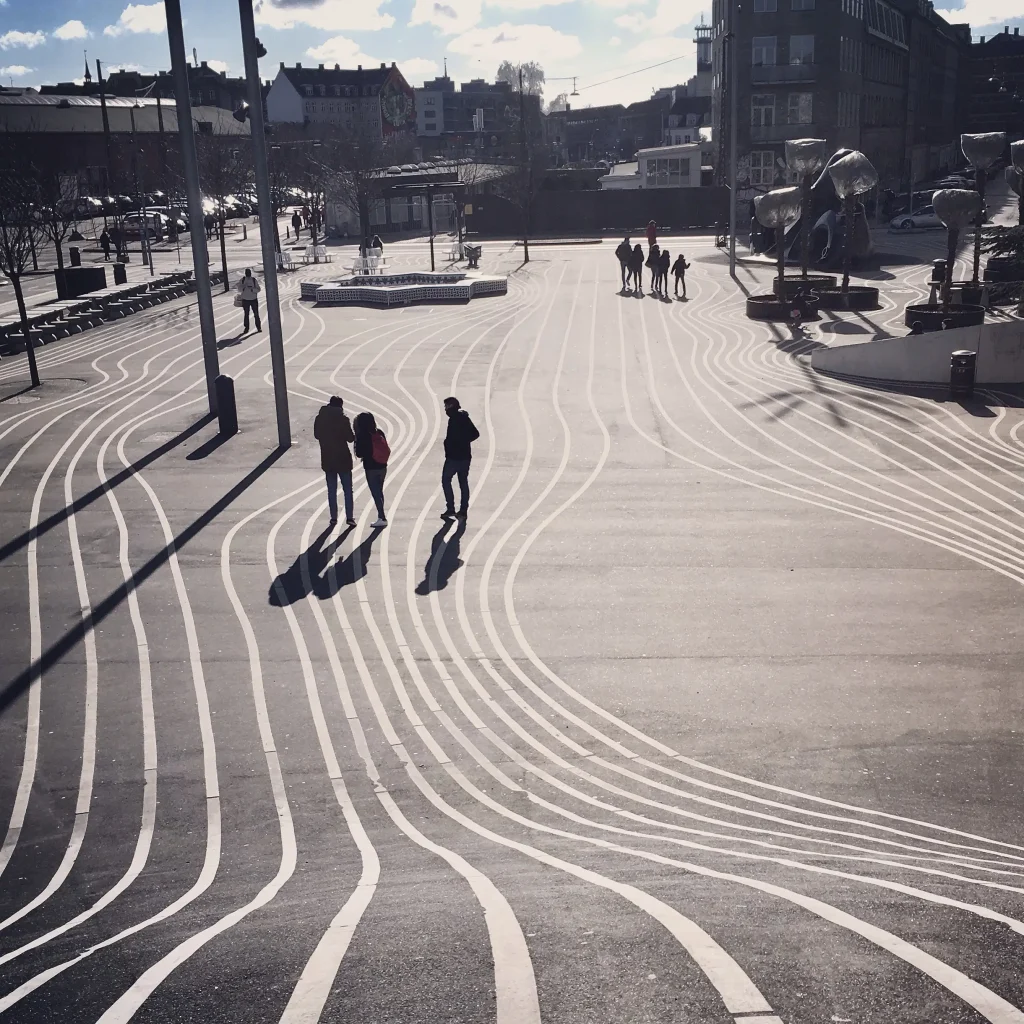
I just spent a few days in beautiful Copenhagen. While visiting Pia, who currently lives and works here, I also had the chance to experience the warm people, cozy cafes, functional design and great food – or simply – “hygge” as they call it here.
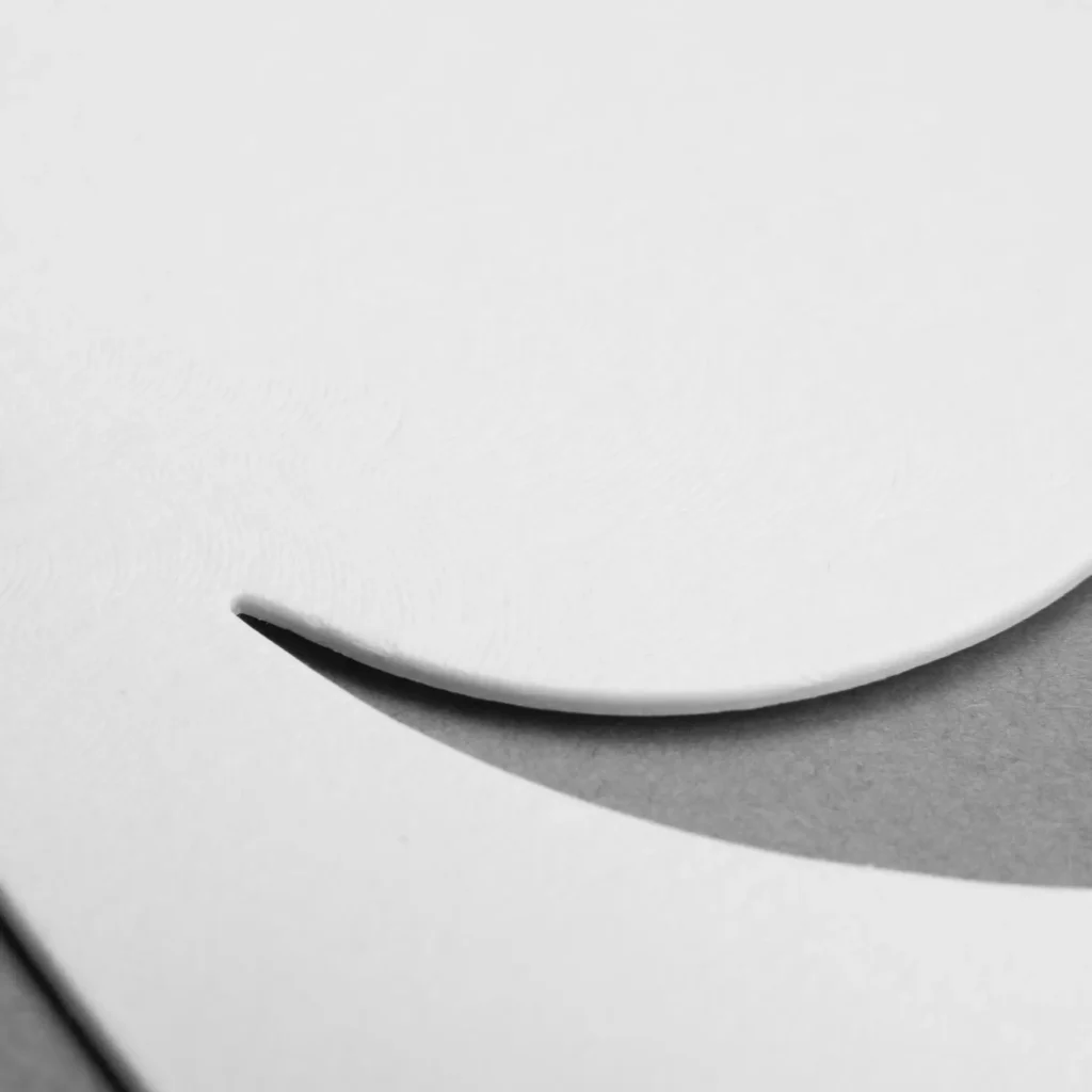
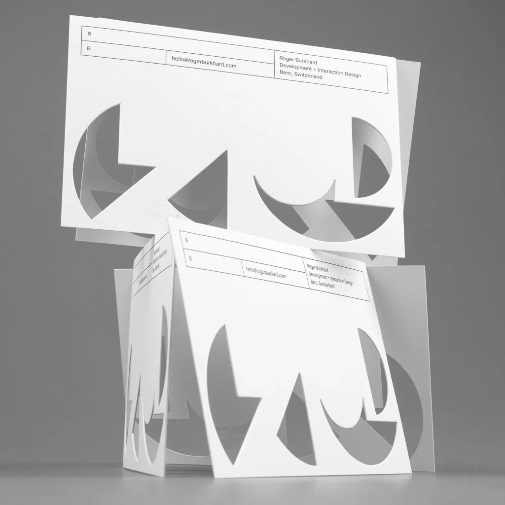
The greeting cards designed by Lundgren+Lindqvist have now been photographed and published by the Swedish printing company Göteborgstryckerie.
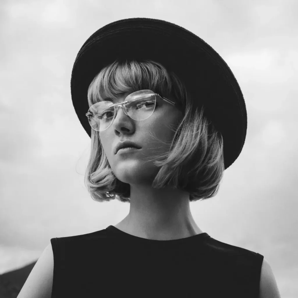
Happy to announce that Frame Optik’s website has been featured on Brutalist Websites in collaboration with Manuel Kreuzer.